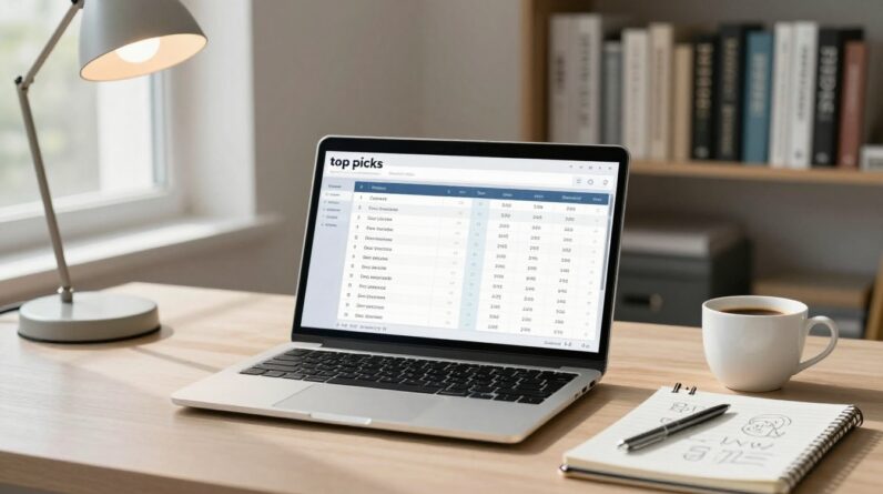
You’ve seen them on review posts and “best of” guides: that neat top picks table near the top that seems to pull your eyes in and make choosing feel easy.
When it’s done right, readers click because it helps, not because it pushes.
If yours isn’t getting clicks, it’s rarely the products.
It’s usually the presentation.
Row order, labels, and the way you ask for the click can either build trust fast or trigger doubt fast.
This is a practical way to build a “Top Picks” table that earns clicks, without gimmicks and without turning your content into a sales page.
Start with a top picks table layout people can scan in 5 seconds
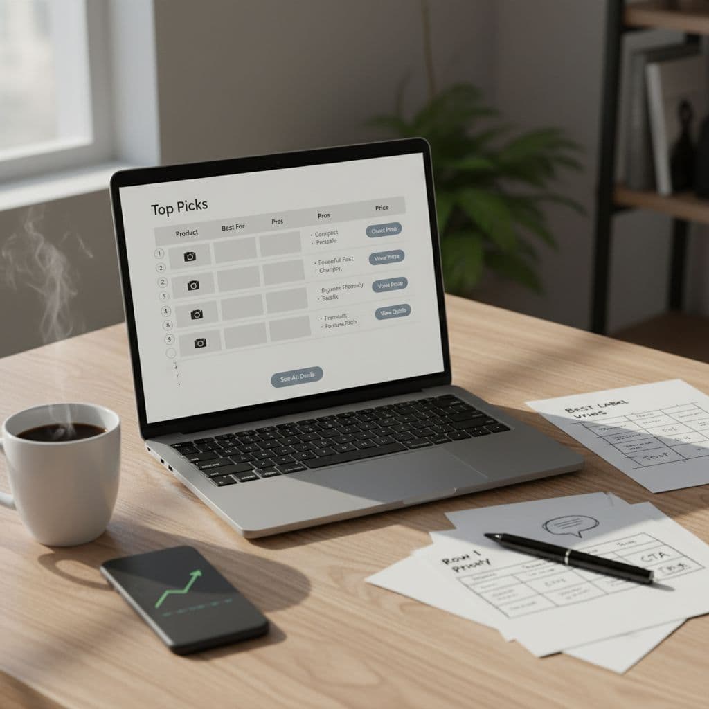
A top picks table works like a shortcut sign on a highway.
Your reader is moving fast, they want the safe exit, and they don’t want to read 2,000 words to find it.
So before you worry about row order and CTAs, get the shape right.
A strong table usually has 4 to 6 rows (more feels like a catalog), and 4 to 5 columns (more becomes a spreadsheet).
You want just enough info to help someone choose, and just enough friction removed that clicking feels reasonable.
A simple column setup that stays clear on desktop and mobile:
- Product (name plus a short label)
- Best for (one clear use case)
- What you’ll like (2 to 3 quick pros, not a paragraph)
- Price or “starts at” (optional, but helpful if you can keep it accurate)
- CTA button (one action)
Keep the “What you’ll like” column specific.
“Easy to use” is weak.
“1-click setup” or “templates built for Etsy sellers” gives the brain something solid to grab.
Also, place the table where it matches intent.
If your post title is “Best Email Tools for Coaches,” readers expect to compare options early.
Put the table near the top, right after a short setup, then go deeper below with your full reviews.
If you’re still building the rest of your affiliate system, the simplest path is to pair this table with a clean content plan like the one in this step-by-step guide for beginners to start affiliate marketing.
A good table works best when it sits inside a consistent publishing habit.
Row order and labels: the small choices that drive most clicks
Row order isn’t a decoration.
It’s a recommendation hierarchy, and readers treat it like one.
Put the “safe default” in Row 1
Row 1 gets the most attention, even from people who claim they “compare everything.”
That spot should go to the pick that fits the largest slice of your audience with the fewest surprises.
Think of it like ordering at a new restaurant.
Most people choose the dish that’s popular and low-risk.
Your Row 1 should feel the same.
Use this quick filter to pick your #1:
- Works for most readers in the post’s target group
- Has fewer deal-breakers (price, learning curve, hidden fees)
- Matches your main promise in the headline
If the best product is pricey or niche, don’t force it into Row 1.
You’ll get clicks, then refunds and angry comments later.
Rows 2 and 3 should be “clear alternatives,” not leftovers
Row 2 and Row 3 work best when they are clean contrasts, like:
- Best budget pick
- Best for advanced users
- Best for speed (done-for-you)
- Best for a specific platform (Shopify, WordPress, Amazon, etc.)
Your goal is to reduce mental load.
If the reader sees themselves in a label, they’ll click.
Use labels that sound like a friend, not a product box
Labels are where many affiliates accidentally sound salesy.
Keep them simple and human.
Good label styles:
- Best for: “Solo founders who want simple setup”
- Why it’s here: “Strong reporting, clean interface”
- Watch out for: “Costs more once your list grows”
That last one matters.
A “watch out for” line can increase clicks because it signals honesty.
You’re saying, “I’m not hiding the tradeoffs,” and that earns trust.
One more detail: avoid vague awards like “Editor’s Choice” unless you explain what it means.
Better is a plain promise like “Best all-around pick” or “Best if you hate tech.”
Three safe CTA styles that win clicks (without pressure)
Your CTA button is the handshake.
Too soft and people drift.
Too aggressive and people pull away.
The sweet spot is a clear action that matches what the reader wants to do next.
Here are three CTA styles that stay “safe” for trust and compliance, and still pull clicks.
1) “Check price” (best for product lists and fast buyers)
Use it when: price is a deciding factor, and readers are comparison shopping.
Why it works: it gives a practical reason to click that doesn’t feel like a hard sell.
It also sets the expectation that they’re going to see pricing, not a surprise funnel.
Good variations:
- Check price
- See today’s price
- View pricing
Keep it consistent across the table.
If every row has a different vibe, the table feels messy.
2) “See details” (best for cautious readers)
Use it when: the product needs a little context to make sense (features, compatibility, plan options).
Why it works: “details” is a research word.
It matches the mindset of someone who wants to confirm before committing.
Good variations:
- See details
- See features
- Learn more
This CTA also pairs well with honest labels like “Best for beginners” because the reader is thinking, “Is it really beginner-friendly?”
“See details” gives them a next step that feels natural.
3) “View on official site” (best for trust and brand-sensitive niches)
Use it when: trust matters more than hype (finance, health, business tools), or when readers worry about fake deals.
Why it works: it signals you’re sending them straight to the source.
That calms the “Is this sketchy?” alarm.
Good variations:
- View on official site
- Visit official site
- See it on the official site
A quick warning: avoid CTAs that imply guarantees you can’t back up, like “Get the best deal” or “Save big now,” unless you can prove it and keep it current.
Stale claims kill trust.
Quick CTA placement tips (small, but they matter)
- Put the CTA in the rightmost column so it’s the final step after scanning.
- Use one primary button style, same color and shape for each row.
- Make the button text action-based, and keep it short (2 to 4 words).
If you want to get nerdy in a good way, test one change at a time: row order first, then labels, then CTA wording.
That way you’ll actually know what moved clicks.
Takeaways for a top picks table that earns trust
Your top picks table is a promise: “I’ll save you time, and I won’t waste your click.” Put your safest all-around choice in Row 1, label each pick with a real-life use case, and choose a CTA that matches the reader’s next step (price, details, or official site).
Keep it clean, keep it honest, and treat the table like the front door to your recommendations.
Your next move is simple: update one table this week, then watch what happens to clicks for 7 days.
What would you change first, your row order or your CTA text?