You’ve got an affiliate page that gets traffic, but sales feel random.
Some days a few commissions roll in, other days it’s crickets.
That usually means the page isn’t guiding people the way you think it is.
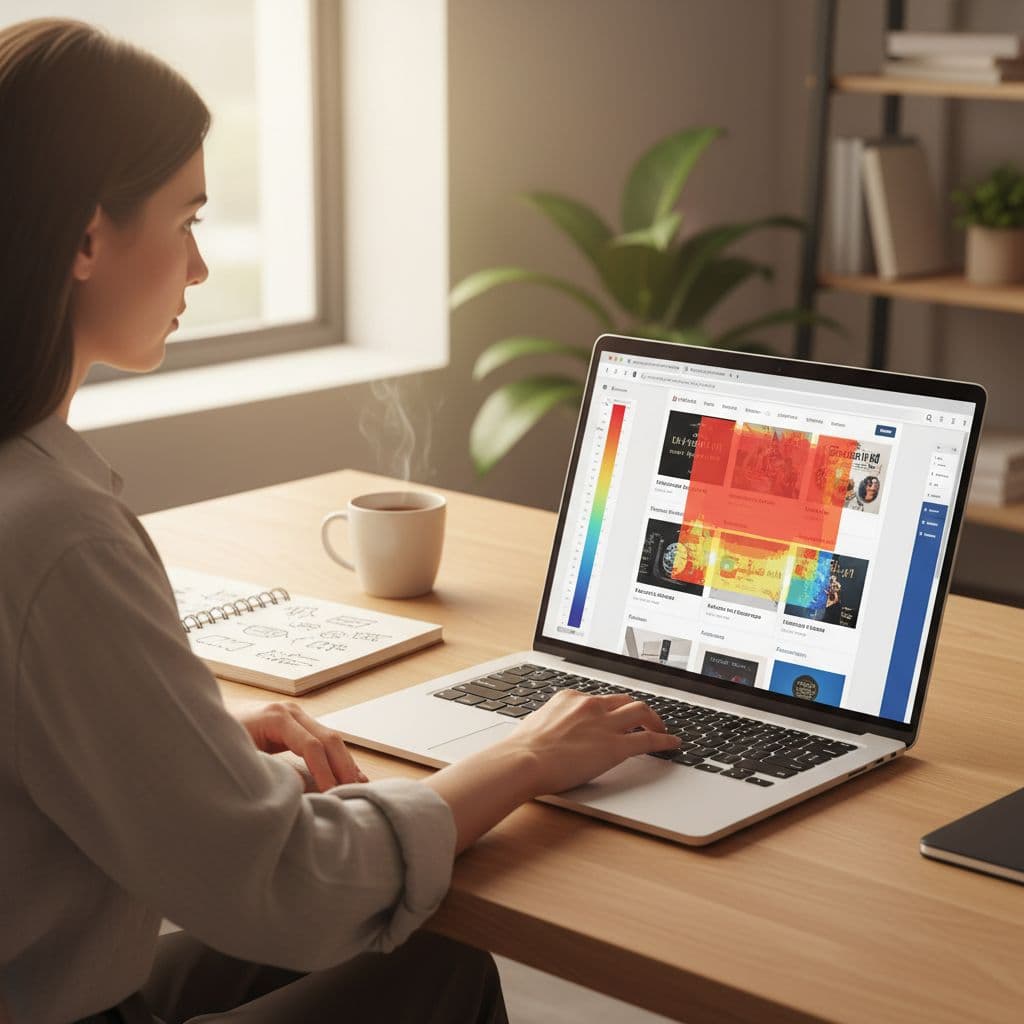
A Microsoft Clarity heatmap gives you the blunt truth.
It shows where real visitors click, how far they scroll, and where attention goes cold.
Once you can see the dead zones and the broken click path, fixes stop being guesswork.
This is the same kind of feedback you’d want if you ran a physical store.
If customers keep stopping at the entrance, staring at a shelf, then leaving without reaching the register, you’d rearrange the store.
Your affiliate page works the same way.
Set up Clarity so your heatmaps match buyer intent
Heatmaps are only useful if you’re looking at the right traffic.
Affiliate pages attract a mix of people: curious readers, comparison shoppers, accidental clicks from social, and buyers ready to act.
If you lump them together, your heatmap turns into noise.
Start with a tight scope:
- Pick one money page first (a product review, “best tools” post, or a pre-sell page).
- Wait until you’ve got enough visits to see patterns, not one-off behavior.
- Separate mobile vs desktop early. Mobile scroll and taps change everything.
Then open Clarity and focus on filters.
You want a view that reflects real purchase journeys, not random browsing.
Common filters that help affiliate pages:
Traffic source filter: Compare organic visitors vs social visitors. Organic often scrolls more, social often skims.
Device filter: Mobile users may rage-tap tiny elements or ignore sidebar content.
New vs returning: Returning visitors usually need less education and more direct paths to the offer.
If you’re new to the tool, keep a quick reference handy from Clarity’s own walkthrough on how to use heatmaps in Microsoft Clarity. It’ll save you time when you’re switching between heatmap types and page versions.
One more setup habit that pays off: keep your affiliate links consistent.
If buttons, text links, and image links all point to the same offer, your click map becomes a clear “vote” on what people prefer to click.
Read the heatmap like a story (hotspots, drop-offs, dead zones)
A heatmap is a plot, not a score.
You’re looking for the story of attention and friction.
In Clarity, you’ll usually rely on three views:
Click heatmap: Shows what people try to click. Great for spotting distraction and false clicks.
Scroll heatmap: Shows how far people actually get. Great for finding content that never gets seen.
Area heatmap: Lets you measure clicks in a section you care about, like your top CTA block.
Now let’s talk about dead zones, the parts of your affiliate page that get ignored.
A dead zone isn’t “bad design.” It’s just unused real estate, and on an affiliate page, unused space often means lost money.
Dead zones often show up as:
- A long intro paragraph that looks “nice” but doesn’t earn attention.
- A comparison table or specs section placed too far down.
- A sidebar full of widgets that pull focus without helping decisions.
- A CTA that sits below the average scroll depth.
Watch for the opposite problem too: hot clicks in the wrong place.
If your heatmap shows heavy clicks on a non-clickable product image, readers are telling you what they expected.
If your heatmap lights up on an FAQ toggle but your affiliate button stays cold, your page is answering questions but not asking for the click.
This is where session recordings help.
Heatmaps tell you “where,” recordings tell you “why.”
If you want a deeper read on turning heatmap signals into actions, Clarity’s guide on making the most of heatmaps data is a solid companion.
Your goal in this stage is simple: write down the top 3 dead zones and the top 3 surprise hotspots.
Don’t fix anything yet.
Just label what’s happening.
Fix the click path so readers reach your affiliate link sooner
Think of your affiliate page like a walking path through fresh snow.
People will take the easiest route, and once a route forms, the next visitors follow it.
Your job is to shape that route so it leads to the offer, with enough trust-building along the way.
Start by defining your ideal click path in one sentence, like:
“Headline, quick verdict, key benefits, proof, CTA.”
Then use your heatmap notes to adjust the page so the path is obvious.
Move the money blocks above the drop-off point
If your scroll map shows most visitors don’t reach your first strong CTA, move it up.
You’re not “being pushy,” you’re being helpful. Buyers hate scavenger hunts.
A simple structure that often works:
Quick verdict near the top: Who it’s for, who should skip it.
Primary CTA: A button or clear text link.
Support section: Proof, screenshots, personal experience, pros and cons.
Secondary CTA: Another chance to act after trust builds.
If you’re choosing which products deserve that top placement, it helps to start with a solid partner.
This guide on Choosing the Right Affiliate Program for Your Website can help you avoid offers that leak traffic or convert poorly.
Turn “false clicks” into real clicks
When people click something that isn’t linked, you’ve got a gift.
Add a link where the intent already exists.
Common fixes:
Clickable images: If product images get heavy clicks, link them.
Tappable headings on mobile: If readers tap subheads, add a small “check price” link near that section.
Remove tempting dead ends: If your nav pulls attention away, simplify it on money pages.
Make your niche work for you, not against you
Different niches create different reading behavior.
A “best budget laptops” post gets scanning and comparison clicks.
A “how to stop snoring” post gets more story-driven reading, then a single decisive click.
If you’re still picking markets and offers, you’ll get faster wins by aligning page style with the niche.
Use this overview of best affiliate marketing niches for beginners to choose topics where buyer intent is clearer and page flow is easier to build.
After you make changes, go back to Clarity in a week and check the same heatmaps again.
You’re looking for one thing: did the click concentration move closer to your primary CTA?
If you want a visual refresher while you work, this video on Microsoft Clarity Heatmaps 101 can help you recognize patterns faster.
Final takeaways on fixing dead zones with Clarity
Heatmaps don’t reward the prettiest page, they reward the clearest path.
Use a Microsoft Clarity heatmap to find where attention goes cold, then reshape the page so your best links show up before most visitors drop off.
Make one change at a time, re-check the heatmap, and let real clicks guide your next edit.