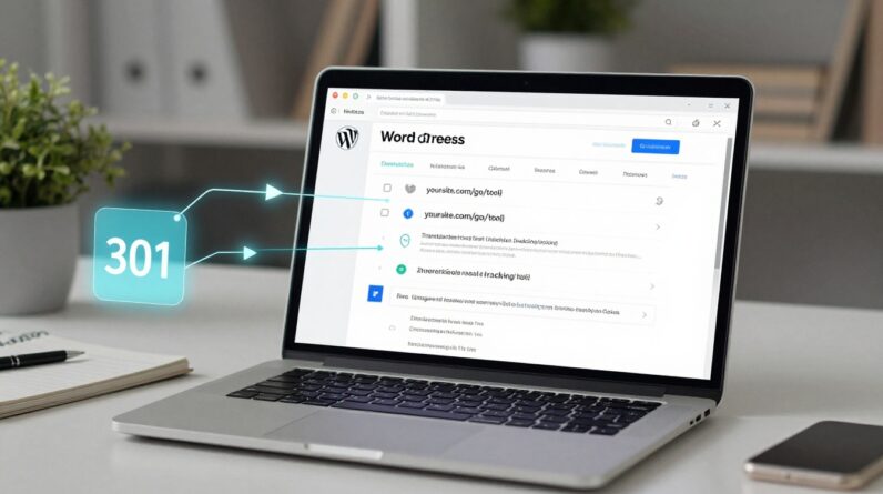
If your affiliate links are scattered across blog posts, YouTube descriptions, and random “resources” pages, you’re basically sending buyers into a messy garage and hoping they find the right tool.
A link hub page fixes that. It’s the clean shelf with labels, the place where someone lands, scans, compares, and takes action without getting lost.
If you’re an entrepreneur building steady online income, this is one of the simplest page types you can add. It works because it matches how people shop: they want options, quick answers, and a clear next step.
Start with one category and a simple page job

A link hub page is not a blog post that happens to have links. It’s a category “home base” with one job: help a buyer choose the right product in that category, then click through with confidence.
Pick a category that stays tight. “Email marketing tools for creators” is tight. “Online business tools” is not. If you go too wide, your page turns into a junk drawer.
Before you write anything, decide the page promise in one sentence, like: “This page helps you pick the best beginner-friendly project management software for a small team.” That promise becomes your intro, your section headings, and your CTA wording.
You’ll also want to plan 3 to 5 supporting pages that your hub can point to, like a full buying guide, a single best pick review, and a comparison post. If you’re still getting your footing, it helps to read through the basics in this archive on getting started with affiliate marketing, then come back and build your hub with a clearer head.
Sections that make your link hub page easy to scan
Think of your link hub page like a well-run shop. The front door should show the “best sellers,” the aisle signs should be obvious, and the checkout should be easy to find.
A strong layout usually follows this flow:
1) Above-the-fold header (keep it calm)
Start with a clear category headline, a two-sentence promise, and one primary CTA that fits your goal (example: “See top picks”). Right under that, add a short affiliate disclosure in plain language so you don’t create trust issues later.
2) Quick jump links (mini table of contents)
This is the fastest way to reduce scroll fatigue. Use jump links like Top picks, Best for beginners, Budget options, Best for teams, FAQ. Your visitor gets control, and that keeps them on the page longer.
3) Top picks (3 to 5 products, not 15)
This is your money section. Use small product cards with the same format each time: who it’s for, one standout benefit, one tradeoff, and a CTA button. Keep the copy honest. People can smell “salesy” from a mile away.
4) “Best for…” sections (intent-based buckets)
This is where conversions often come from because you’re matching a person to a situation. Examples: best for beginners, best for tight budgets, best for advanced users, best for a small team. If you sell to entrepreneurs, “best for solo operators” usually hits.
5) FAQ (objections and buying friction)
Answer questions that block clicks: pricing style, refunds, learning curve, what to pair it with. Short answers win here.
If you want a broader system for earning your first commissions while building pages like this, keep this guide handy: How to earn $500 in 30 days with affiliate marketing. It reinforces the habit that matters most, consistent helpful content that earns trust.
Internal links that move readers without sending them away
Internal links are the “hallway signs” of your site. Done right, they keep a reader moving in a straight line. Done wrong, they feel like a dozen open tabs and no decision.
Here’s a clean system that works for a one-category link hub page:
Use two link types on the hub page
Support links (your own content): These go to your deeper pages, like “Product A review,” “Product A vs Product B,” or “How to choose X for your situation.” Put these near the relevant product card, not in a random list at the bottom.
Decision links (affiliate links): These go to the offer. Keep them focused and consistent, one main button per product card, plus an optional text link in the description if it reads naturally.
Keep your supporting content tight
Aim for 3 to 5 supporting pages per hub. More than that can wait. If you already have a lot of content, pick the best ones and link only those.
Also, make the linking two-way:
- Hub page links out to the reviews and comparisons
- Each review links back to the hub with a line like “Want to compare the top options quickly? Go back to the category hub.”
One more practical tip: if you’re still choosing which networks and programs to join for the category, this previous tag page can help you sort your options: Top affiliate programs to join in 2025. A hub page works better when your offers are stable, reputable, and easy to explain.
Finish strong with CTA rules that feel natural
A link hub page lives or dies by its calls to action. The trick is simple: your CTA should feel like the next helpful step, not a shove.
Use these rules as your default:
One main CTA per product card: Pick one action and repeat it across the page, like “Check current price” or “See features.” Too many buttons create hesitation.
Match the CTA to the reader’s intent: Early sections can use softer CTAs (example: “See why it’s a top pick”). Later sections can be more direct (example: “Try it now”).
Put CTAs where decisions happen: Add a button inside each product card, then add another after your FAQ for the reader who needed reassurance before clicking.
Keep button text specific: “Get started” is vague. “See plans” tells them what happens next.
Don’t hide the tradeoff: A short “Best for” line plus one limitation makes your recommendation feel real, which makes clicks feel safer.
After you publish, watch two numbers: which section gets the most clicks, and which product gets the most clicks. Then adjust your order. Your hub should act like a storefront you keep tidy, not a page you set and forget.
If you build your first link hub page this week, what category would make your audience’s choice easier right away? Pick one, keep it tight, and make the next click feel obvious.