Your reader is stuck between options, and you can feel it in their scrolling.
They want the “right” choice, but they don’t want to read 4,000 words to get there.
That’s where an affiliate product picker works like a good shop assistant.
It asks a few smart questions, then points to the best match with a clear reason why.
Your reader gets relief, you get the click, and the recommendation feels earned, not pushed.
This post walks you through a simple “best for” picker you can build in an afternoon: a quick quiz, scoring rules that stay honest, and affiliate link setup that’s clean and trackable.
What a “best for” picker does for clicks and trust

A “best for” picker is a short quiz that maps answers to one of a few outcomes (example: Best for Budget, Best for Beginners, Best for Power Users).
Think of it like a fork in the road with signs that actually help.
It works because it does three things fast:
- Cuts decision fatigue: fewer choices, less doubt.
- Sets expectations: “best for” frames a product as a fit, not a miracle.
- Gives you a reason to link: the recommendation feels like the natural next step.
If you’ve ever watched someone stare at a restaurant menu for 10 minutes, you get it.
People don’t hate choices, they hate choosing wrong.
Pick 3 to 5 outcomes that match real buyer intent
Your product picker fails when it tries to cover everybody. Keep it tight.
Start with one clear buying moment, then pick outcomes that match it.
A clean set of outcomes often looks like this:
- Best for beginners: simple setup, fewer features, strong support.
- Best for budget: lower monthly cost, decent core features.
- Best for teams: collaboration, permissions, admin controls.
- Best for creators: templates, publishing tools, automations.
- Best for power users: deep settings, advanced workflows.
Then choose 1 product per outcome.
If you can’t honestly name a winner for an outcome, drop that outcome.
Commission comes after fit.
If you want a simple foundation for getting early commissions the ethical way, this step-by-step affiliate marketing guide for beginners pairs well with a picker like this.
Build a quick quiz that feels like a shortcut (6 to 8 questions)
Your goal is speed. If the quiz feels like homework, people quit.
A good structure is 6 to 8 multiple-choice questions where each answer nudges points to one or two outcomes.
Here’s an example for a software picker (swap in your niche):
- What’s your main goal right now?
Grow an email list, sell products, manage clients, save time - What’s your monthly budget?
$0 to $15, $16 to $49, $50+ - How techy do you feel today?
Keep it simple, I can follow steps, I like advanced settings - What matters most?
Price, ease of use, automations, reporting, support - How many people will use it?
Just me, 2 to 5, 6+ - How soon do you need results?
Today, this week, I’m planning ahead - Which style fits you?
Templates, blank canvas, guided setup
Keep answer options short.
Avoid “all of the above.”
Every option should tell you something.
If you want a starting point for quiz flow and page setup ideas, see this guide on creating a product recommendation quiz.
Tool choice (don’t overthink it)
You can build this with a dedicated quiz tool, a form builder plus logic, or even a simple “question page” that jumps to results.
If you want a ready-made quiz builder made for outcomes, look at Interact’s product recommendation quiz maker.
Scoring rules that stay simple (and don’t feel rigged)
Scoring is where most pickers get messy.
You don’t need fancy math, you need consistency.
Start by listing your outcomes, then assign points per answer.
A simple pattern that works:
- Strong match: +3 points
- Medium match: +2 points
- Light match: +1 point
- Poor match: 0 points
- Deal-breaker: disqualify an outcome (rare, use carefully)
Example: If someone chooses “$0 to $15,” your Budget outcome might get +3, Beginners gets +1, Power Users gets 0.
Two rules keep it fair:
Rule 1: Weight the “must-have” questions.
Budget, team size, and main goal often deserve bigger points than “style preference.”
Rule 2: Add a tie-breaker you can explain.
If two outcomes tie, break ties with one priority question (example: budget wins ties, or “ease of use” wins ties). Then say so on the results page in plain language.
Also, sanity check your quiz by taking it 10 times with different answers.
If the same product wins every time, your scoring is off or your outcomes are too similar.
Set up results pages that earn without sounding salesy
Your quiz result shouldn’t just name a product.
It should tell a short story: “You said X, so Y makes sense.”
Use this layout for each result:
- Headline: “Best for: Budget” (or similar)
- One-sentence fit: who it’s for
- 3 quick reasons: match the answers they just gave
- What to watch for: one honest drawback
- Who should skip: a clear “not for you if…”
- Your recommendation link: one clear call to action
Keep the first affiliate link close to the top, after your fit statement.
Add a second link near the bottom for people who need more reassurance.
If you want higher trust, include a “second choice” option under a subheading like “If you want more features later.”
That saves the sale when someone’s on the fence.
Affiliate link setup: tracking, disclosures, and clean clicks
Your link setup is part of the product.
Messy links create doubt.
Here’s a clean system you can run with:
Place a clear disclosure near the first link.
One line is enough: you may earn a commission at no extra cost to them.
Put it before the first affiliate link and again in your site-wide footer or disclosure page.
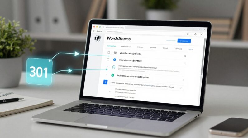
Use link labels you can track.
Even if you don’t run ads, you still want to know which result is earning.
Create separate tracking IDs for each outcome, or separate links per result page (Budget-link, Beginner-link, Team-link).
Use the right link attributes.
For affiliate links, mark them as sponsored (many site tools can do this for you).
This is about transparency and standards, not tricks.
Deep link to the right page.
Send “Best for Beginners” traffic to the beginner-friendly plan page, not a generic homepage.
Fewer clicks between intent and checkout usually means fewer drop-offs.
Test your links like a reader.
Click from mobile.
Click from desktop.
Open in a private window.
If anything looks off, fix it before you send traffic.
If you want more examples of how quiz-based recommendations are structured, this step-by-step breakdown on building a product recommendation quiz is worth scanning for layout ideas.
Final steps to publish your affiliate product picker
Don’t wait for perfection.
Launch, then tighten it with real data.
Start with three checks:
- Drop-off point: where people quit the quiz (shorten or reorder that question)
- Result balance: are outcomes evenly reached (or is one outcome hogging wins)
- Link clicks by result: which “best for” outcome makes money, which needs better copy
Then update monthly. Prices change, features change, and your credibility is the asset you’re building.
Your next move with an affiliate product picker
A good affiliate product picker turns browsing into choosing, and choosing into clicking, without pressure.
Keep your quiz short, make your scoring easy to explain, and treat link setup like part of the user experience.
Pick one niche page you already get traffic on, add a “best for” quiz, and publish it this week.
Momentum comes from shipping, then improving what readers already showed you they want.