You’ve probably seen this happen: people click your affiliate link, they look around, then they disappear. No sale, no email, no second chance.
A simple affiliate bonus page fixes that gap. It gives your visitor a clear reason to buy through you, without making you write a long review, record a 30-minute video, or build a complicated funnel.
Think of it like setting a clean checkout sign next to a busy aisle.
You’re not adding more “store,” you’re adding direction.
What an affiliate bonus page really does (in plain English)
Your bonus page has one job: make the next step feel safer and more rewarding.
You’re not trying to replace the vendor’s sales page.
You’re giving a short bridge between “I’m curious” and “I’m buying,” with two conversion drivers:
1) Clarity: Who is this for, what do you get, what do you do next?
2) Value: Extra help that removes friction, saves time, or lowers risk.
If you want inspiration for what high-converting pages look like across niches, skim a few examples at LanderLab’s affiliate landing page examples.
You’ll notice a pattern: strong headline, tight sections, one clear call-to-action.
The simplest affiliate bonus page layout (one screen first)
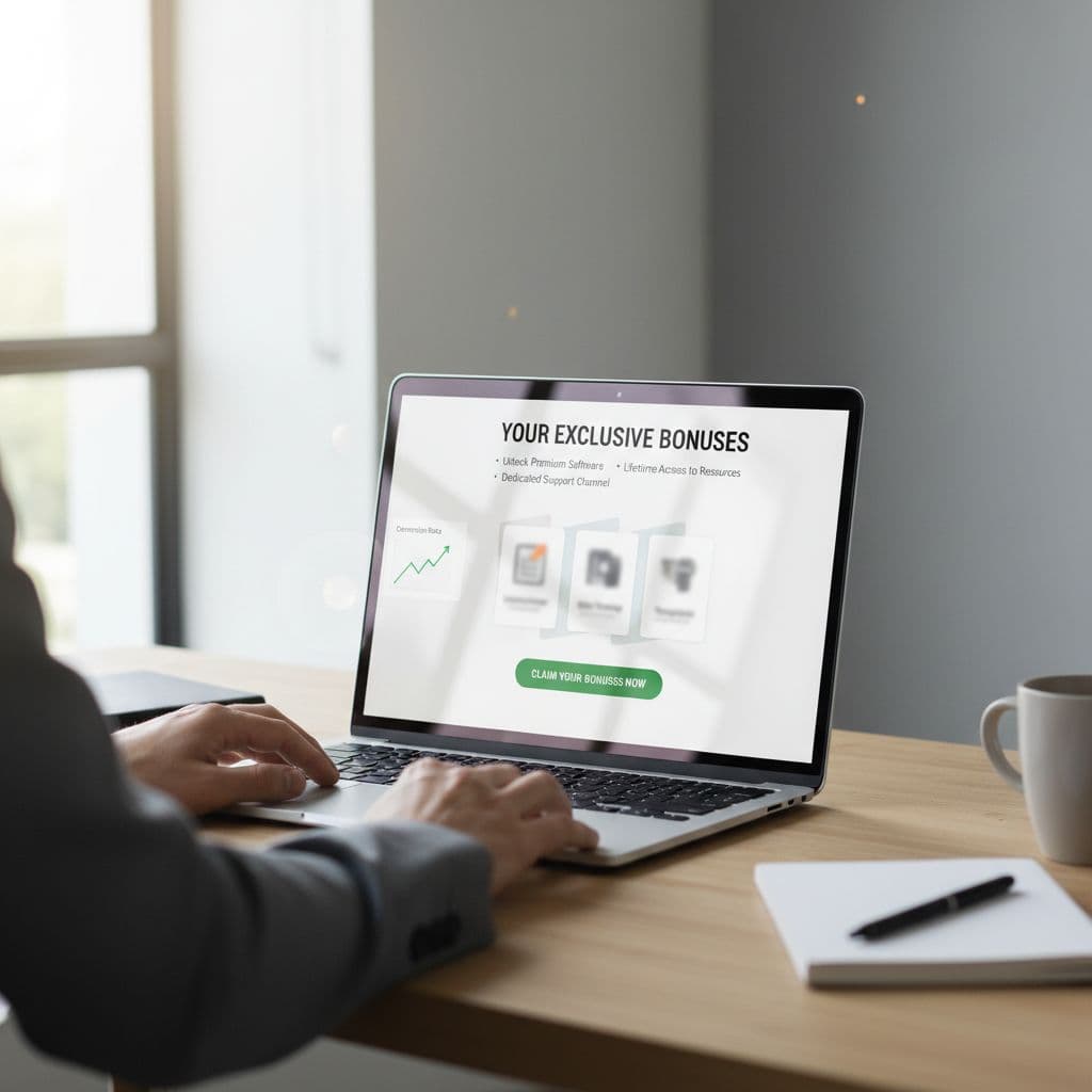
Your page can be short and still persuasive. Aim for a layout that reads like a checkout helper, not a blog post.
Section 1: A direct headline that matches the offer
Your headline should connect to the exact thing they’re about to buy.
Examples:
- “Get [Product] Plus My Quick-Start Bonus Pack”
- “Buy [Product] Through This Page and Claim These Extras”
Keep it simple. If your headline sounds like a billboard, rewrite it.
Section 2: A 3-bullet promise (results, not features)
Three bullets is enough.
Each bullet should answer, “What gets easier for me?”
- “Set it up in under 30 minutes with my checklist”
- “Avoid the common first-week mistakes”
- “Follow a plug-and-play plan for your first results”
If you want help tightening headlines and bullets, this internal guide on headline psychology that converts more readers is a strong refresher.
Section 3: The bonus stack (with quick descriptions)
Show 3 to 5 bonuses.
Name each one, add one sentence, then move on.
Use the “trading card” idea: one title, one benefit, one line of proof (like who it’s for).
Section 4: A plain CTA block
Don’t get fancy.
Your CTA block needs:
- A button that goes to your affiliate link
- A reminder that bonuses come from you (not the vendor)
- A short line on how to claim (example: “Send your receipt to…”, or “Use the form below”)
Section 5: A tiny FAQ (only the objections you keep hearing)
Two to four questions is plenty:
- “Do I get the bonuses if I already bought?” (set a clear policy)
- “How fast do I get access?”
- “Does this cost extra?” (answer: no)
That’s the whole page.
If you want more best-practice ideas for landing page structure, AffiliateWP’s guide to high-converting affiliate landing pages is a useful reference, even if you’re not on WordPress.
Build a bonus stack without creating extra content
Here’s the secret that makes this work: your bonuses should feel like time saved and risk removed, not “more stuff.”
You can build a strong bonus stack in one afternoon using assets you can create fast.
Bonus types that convert (and stay simple)
A setup checklist (1 page): The fastest win. People love a clear next step.
A quick-start plan (7 days): One task per day, one page, no fluff.
Swipe copy or templates: Email subject lines, ad angles, DM scripts, captions.
A “common mistakes” sheet: Short, blunt, and practical.
A 10-minute screen recording: Show the first steps, no editing marathon.
Notice what’s missing: a 40-page ebook.
Your visitor doesn’t want homework, they want momentum.
A good test is this: if your bonus can’t be used within 24 hours, it’s probably too heavy.
Match bonuses to the buyer’s moment
Your visitor is about to buy. Their mind is on:
- “Will I actually set this up?”
- “Will I get stuck?”
- “Will I waste money?”
So build bonuses that answer those fears.
Example: If you promote an email tool, don’t offer “Email Marketing Theory.”
Offer “My 5-email welcome sequence template” and “List setup checklist.”
Copy that lifts conversions (without sounding pushy)
A bonus page works best when it reads like a calm friend pointing to the next step.
Use this simple script.
Above the fold
Headline: Get [Product] plus my bonus pack
One sentence: “If you buy through this link, you’ll also get the bonuses below, built to help you get results faster.”
Three bullets: outcomes, not features
CTA button: “Go to [Product]” or “Get [Product] Here”
Bonus section (repeat this pattern)
Bonus #1 name: Quick-Start Checklist
One sentence benefit: “Follow this to set up the basics in one sitting.”
Who it’s for: “Best if you’re starting from zero.”
That last line does a lot of work. It helps people self-select.
Add light proof, not a life story
You don’t need a long case study.
One or two lines is enough:
- “Built from the same steps I use on every promo.”
- “Made for busy entrepreneurs who want a clear path.”
If you want to build a bigger plan behind this later, this internal guide to earn your first $500 with affiliate marketing in 30 days can help you map your traffic and follow-up.
Setup and tracking (quick, clean, and low stress)
Keep your tech simple so you actually publish the page.
Page builder: Any basic page tool works (WordPress, Carrd, Systeme, Leadpages).
Link tracking: Use your affiliate dashboard tracking IDs where possible.
Bonus delivery: A Google Drive folder + an email auto-reply works fine.
Your claim process can be basic:
- Buyer fills a short form
- They upload a receipt or order ID
- You (or an auto-email) sends the bonus link
If you run paid traffic or want design ideas that match current affiliate landing standards, RichAds’ affiliate landing page best practices for 2025 is a helpful scan.
Final takeaways for a bonus page that sells
Your affiliate bonus page doesn’t need more content, it needs more focus.
Keep it short, keep it buyer-first, and make the bonuses feel like a shortcut, not a library.
Build the page today, publish it, then improve one piece at a time (headline, bullets, or bonus names).
That’s how you get compounding gains without burning a weekend on “perfect.”
The next time someone clicks your link, give them a clear bridge and a reason to buy through you.